

Why THIS Layout Is the Best Design You Can Choose for Your Substack
And no, it's not about what looks prettiest...

If you’ve been reading me for a while, you know I don’t like to overcomplicate things. The simpler something is, the better. So today I’m sharing one tip that might save some of you from overthinking when you’re setting up your Substack.
When you’re choosing your homepage layout, you get five options. Most people scroll through them and pick whichever looks best to their eye. Fair enough—it’s your newsletter, your aesthetic.
But here’s the thing: as someone who’s worked with dozens of Substack creators, I’ve learned to look at this decision differently. And after all those projects, I keep coming back to the same recommendation: go with the Magazine layout.
Think like a stranger
Okay, so imagine you’re a stranger who stumbles upon your Substack for the first time. Maybe you saw a Notes post and got curious—who is this person? You click through. Important detail: you’re viewing it in a browser, not in the app :)
You land on the homepage. You’ve got maybe five seconds before you decide whether there’s anything here worth your time.
This isn’t just about your colors or your logo looking nice. You could be writing brilliant stuff, but if you don’t put it front and center, nobody’s going to start digging around to find it.
Why Magazine wins
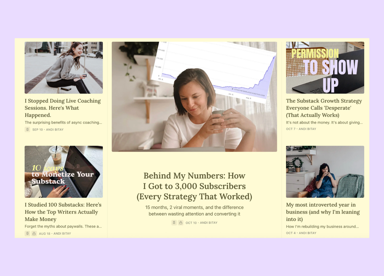
The Magazine layout gives you five immediately visible posts to show what you’re about. Think of it like your first 6-9 Instagram posts: that grid that tells a new visitor what kind of content you create before they’ve read a single caption.
This is your portfolio. Your greatest hits. Your “here’s why you should care” moment.
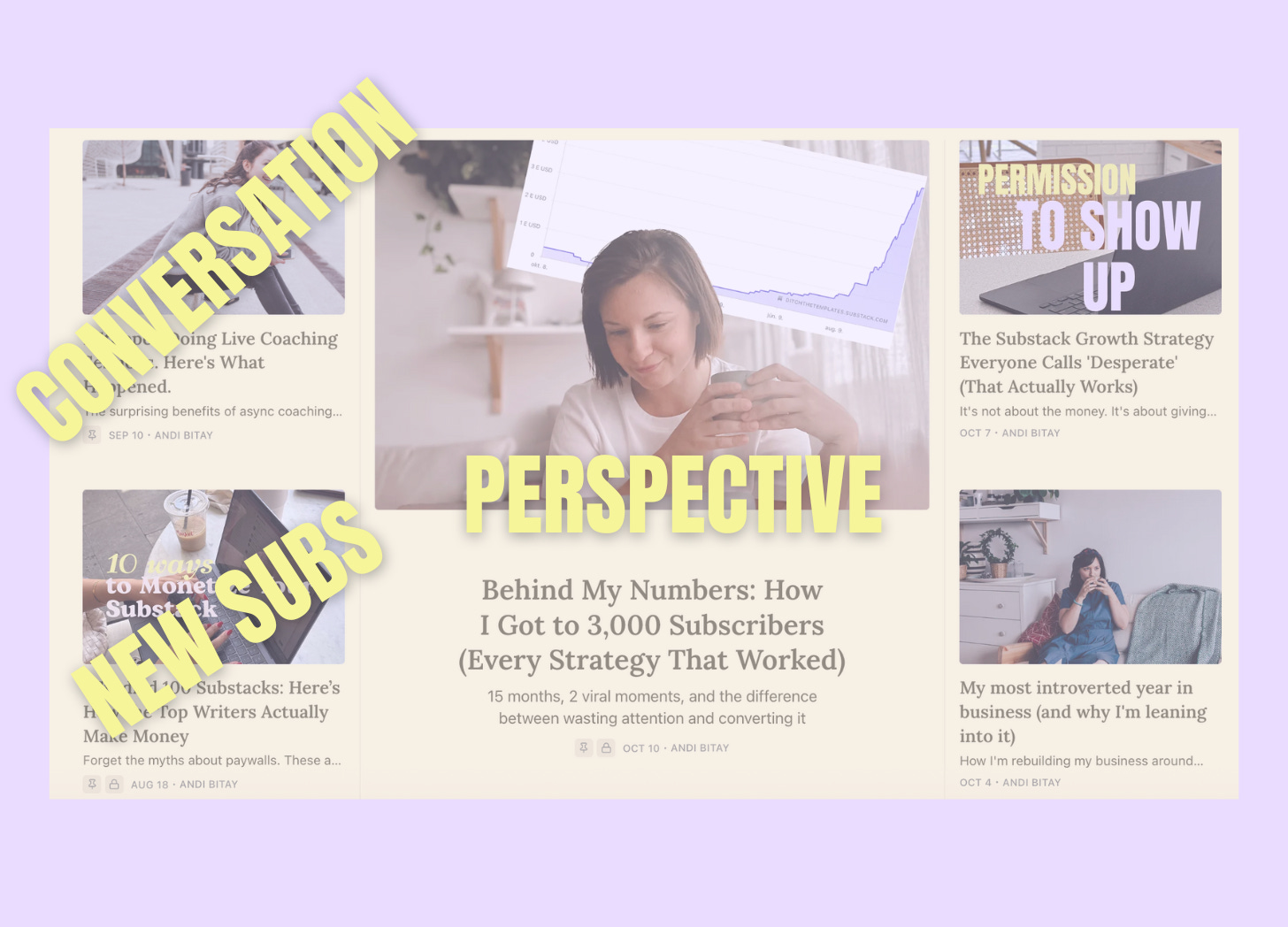
Pin strategically, not randomly
Yes, Substack lets you pin posts. Here’s what I recommend: pin three posts and let the other two slots show your most recent work.
But don’t just pin your most-liked posts. Be smarter about it:
Pick one that shows your perspective—something that reveals how you think, what makes your voice different
Pick one that sparked conversation—check your stats, which post got the most comments and engagement?
Pick one that brought in new subscribers—again, check those numbers
Make sure that at least one clearly demonstrates your expertise and the type of content people can expect.
Together, these three posts should tell a story: this is what I care about, this is what I know, and this is the kind of community we’re building here.
Look, choose a layout that feels right to you. I’m not the design police. But if you want a strategic take from someone who’s been in the trenches with this? Magazine layout. Three carefully chosen pinned posts. Let your best work do the talking.
Warmly,
Andi
P.S. Layout tweaks are nice, but if you’re posting and not seeing traction, it’s usually something deeper, like not being clear on who you’re writing for or what makes you different. I do Substack audits where I look at the whole thing and tell you what I see. Sometimes an outside perspective helps.
If this was useful…
If you found this post helpful, the best way you can support my work is by sharing it with someone who’d benefit from it too.
Substack grows through word of mouth — every time you forward a post, you’re helping me reach more creators who need these insights. And I’m grateful for that. 🤍
Andi, this one sealed it for me.
I’ve read your strategy pieces before, but this article — the simplicity, the “think like a stranger” framing — made me realize I’ve been overcomplicating my own setup. I just subscribed as a paying reader because I want to keep learning from the way you think about structure, not just content.
Starting this week, I’m applying your full framework in earnest across my own publication, Collaborate With Mark. If a fraction of your clarity can rub off on me, it’ll be the best subscription I’ve made all year.
Thank you for making strategy feel both accessible and alive.
— Mark S. Carroll
(Collaborate With Mark)
Love this take!! Brb turning mine into a magazine layout