

Cool Color Palettes for Your Substack Homepage
Colors are more than decoration. They're part of your brand, and the first thing readers feel before they read a single word.

I have to tell you something first: I love experimenting with colors on my Substack. If you’ve been here for a while, you might have noticed that sometimes I change my entire color palette. It’s a game for me. And while I believe we all need the space to play and experiment, I also believe that at some point, you have to choose your colors and commit to them.
Your colors make you recognizable and memorable. For new visitors, they set the first impression, giving people an instant feel for what kind of style and energy they can expect from you.
Taste is deeply personal, so this post is not about telling you what to pick. It’s about making you pay attention to how much your colors actually matter, and giving you enough inspiration and ideas to put together a palette that feels like yours.
Let’s start with where you can actually use colors on Substack.
Pocket Mentoring is back. Starting in June, you get async strategic support to actually build your Substack, not just plan it. From finding your color palette to shaping your whole presence, I’m in your corner. Spots are limited. Sign up here.

Where colors show up on your Substack
Open your Website editor where you can change the appearance of your Substack. You’ll immediately see the color codes you already have (choose the Custom theme to access them).
Background color. This is the background of your entire page. I always recommend making this the lightest color in your palette. That’s how your text stays readable and your other colors actually pop. A lot of people like going full black with white text, and I get the appeal, but my personal take is that it’s tiring on the eyes.

Accent color. This is the color of your buttons and links, and it’s a bigger deal than it looks. Choose something that jumps out rather than blending into the background. It can match your wordmark color or complement it. On my Substack, for example, the purple accent complements the reddish tone of my wordmark rather than matching it.
Welcome page background. You can give your welcome page a different background color, which helps it feel intentional and separate from the rest.
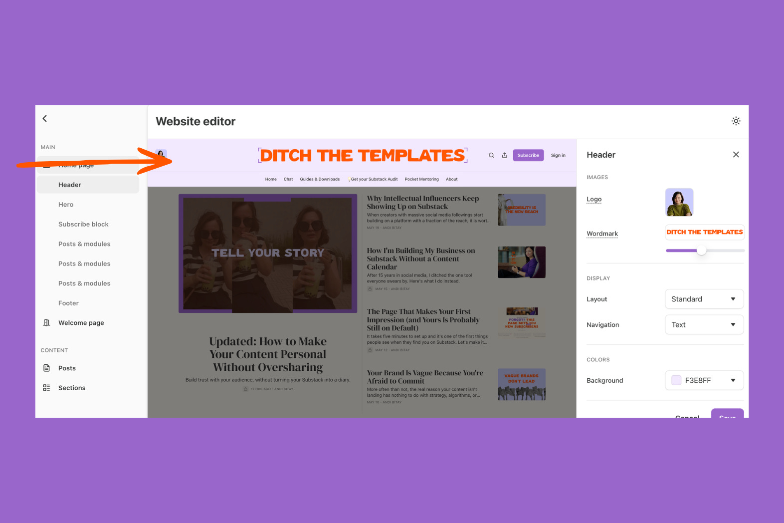
Header background. You can change this independently too. When you do, that top bar visually pops forward and frames everything below it.
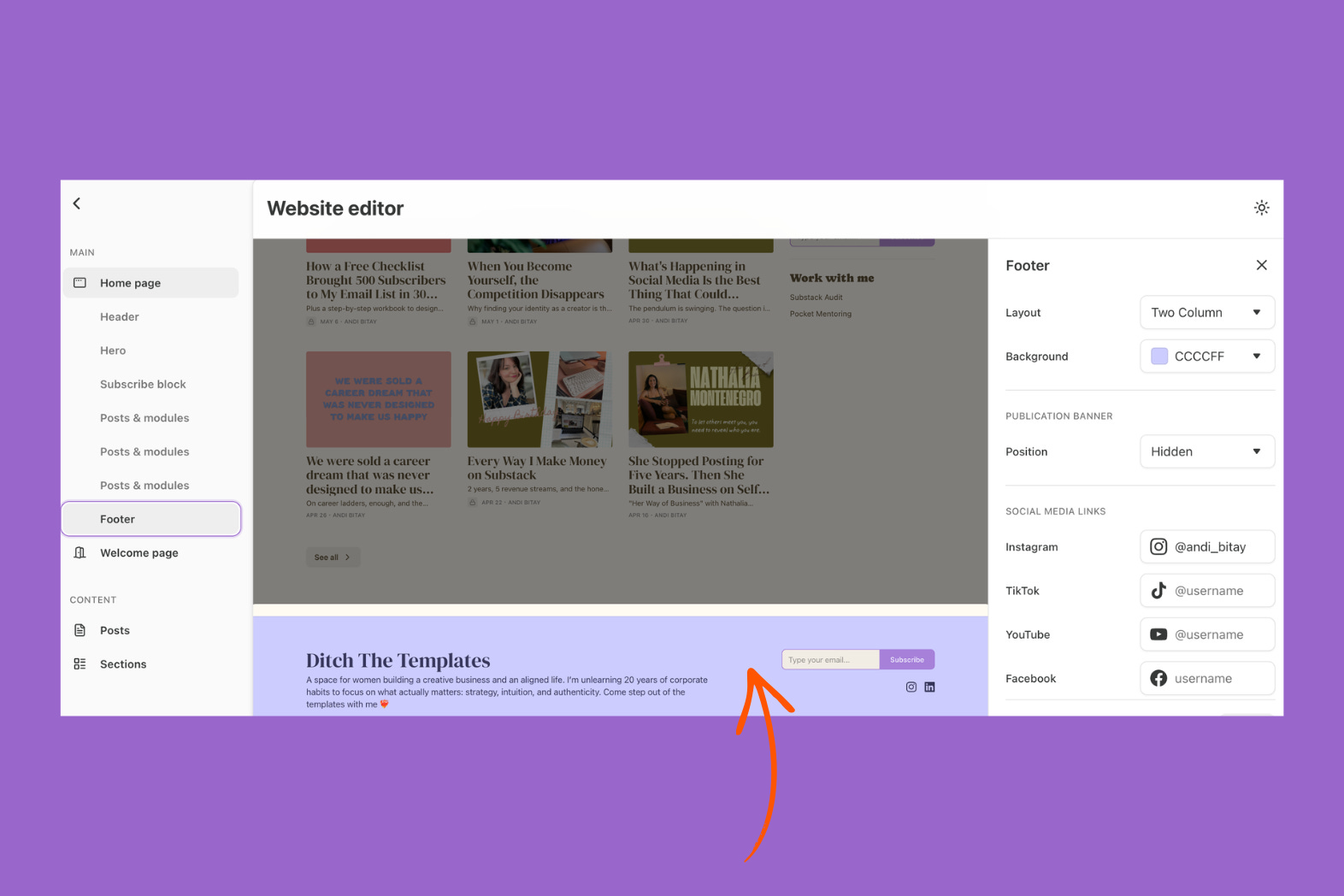
Footer. If you enable and customize your footer, you can give it its own color. I think it’s a stylish way to close out the page, and it’s where all the practical information lives, just like on a proper website.
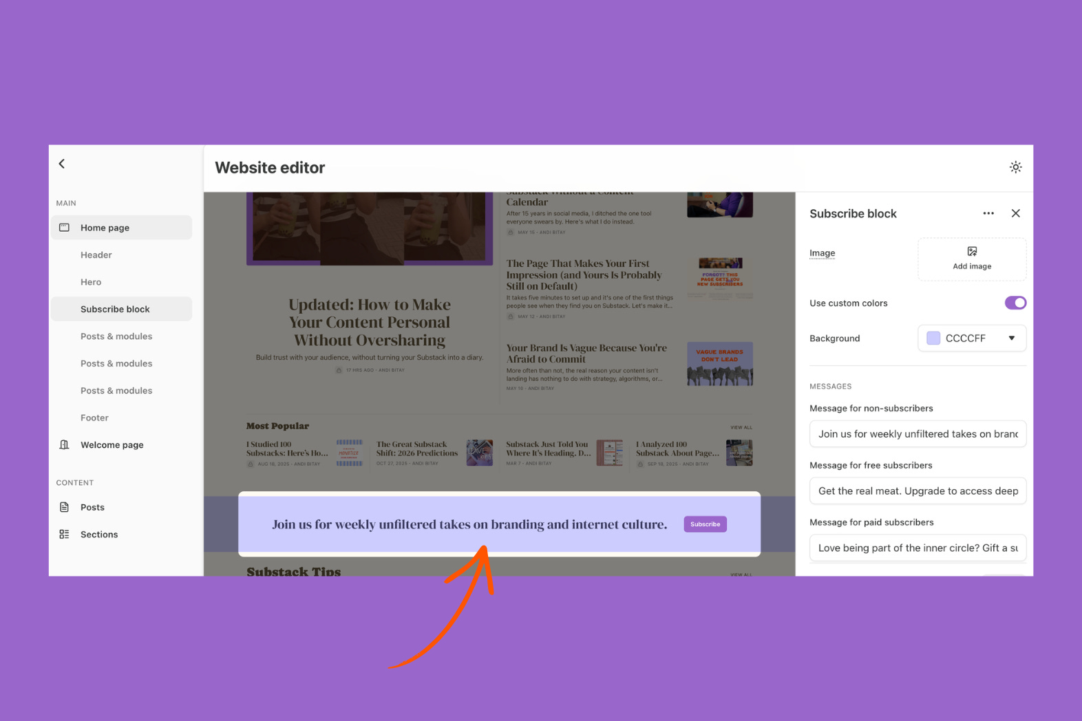
Subscribe block. If you have one set up, you can give it a separate color too. I like making this stand out because it visually breaks up the page and draws attention exactly where you want it.
But your color choices don’t end with these settings. The rest is up to you.
Your wordmark, your logo, your cover images, the visuals inside your posts, subtitle “images”, and page breakers all need to follow the same color palette. I design all of mine in Canva.
Color palettes to inspire your Substack
Now that you know where your colors live, let’s talk about what actually looks good together.
I picked a few Substacks that get their colors right. For each one, I'm showing you the homepage and the exact color codes they use, so you can see how a good palette actually looks in action.
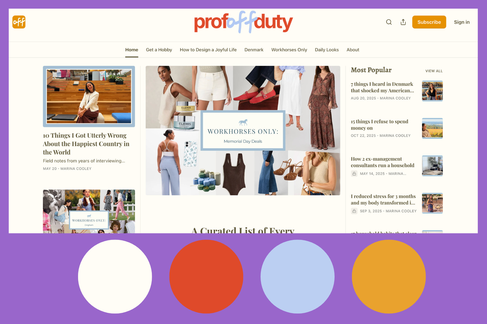
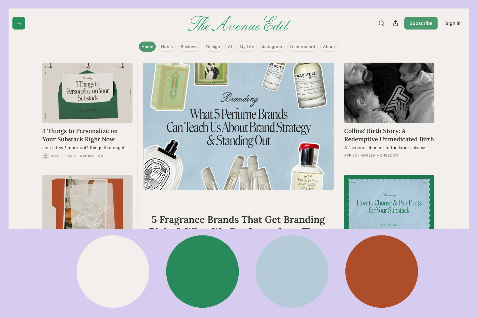
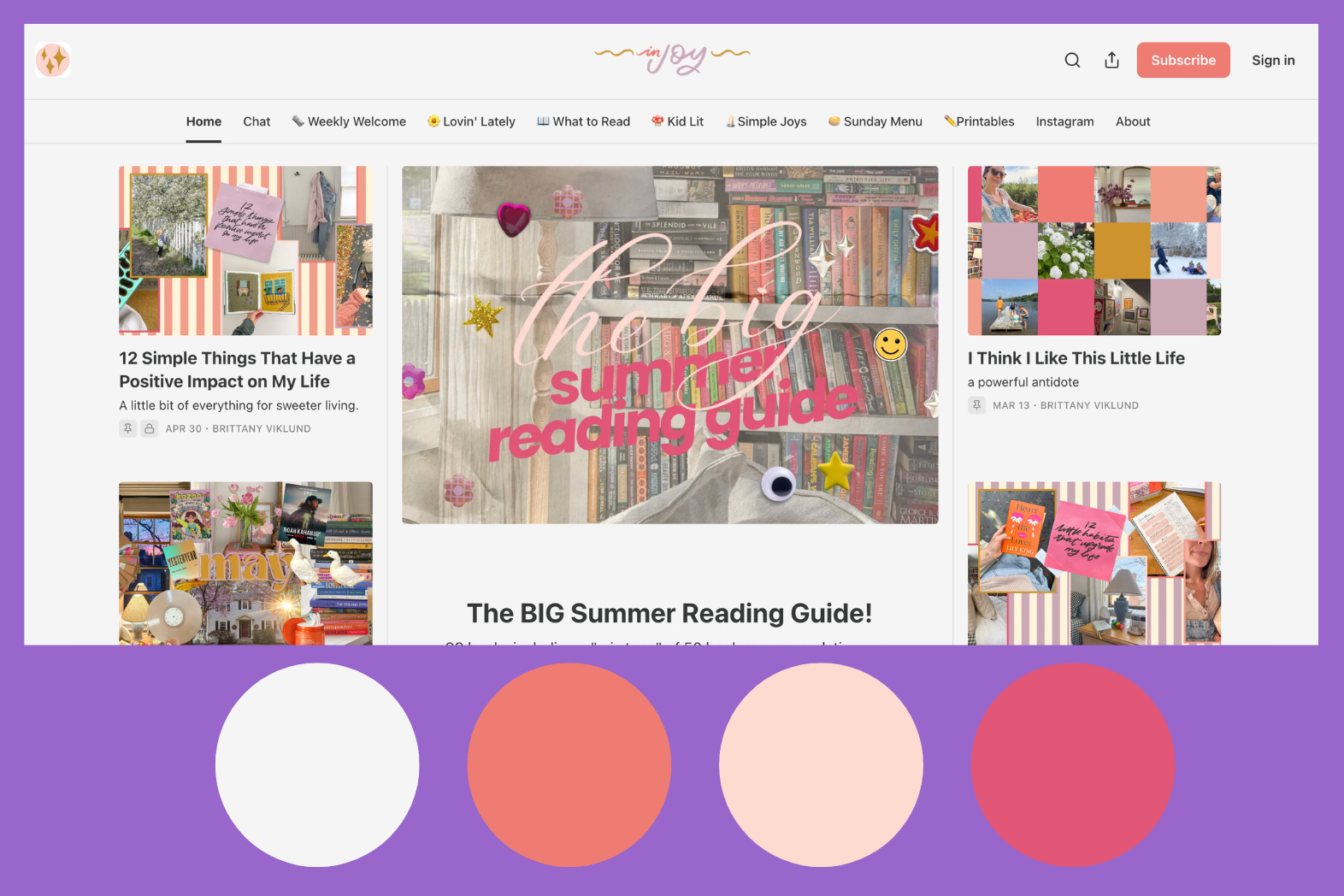
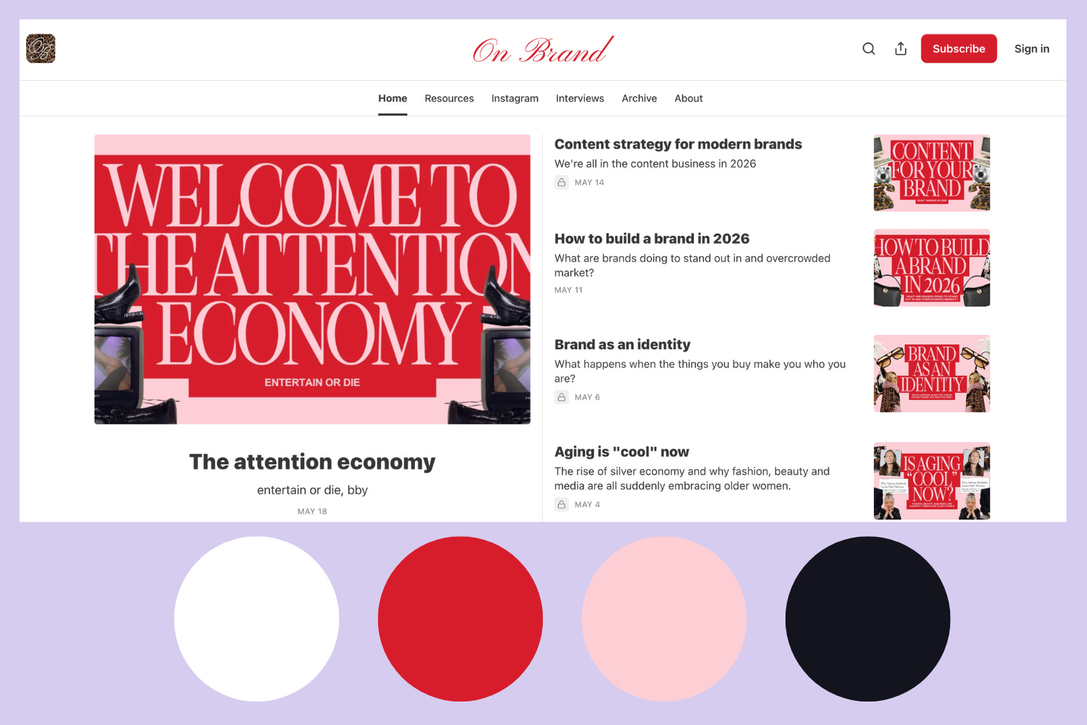
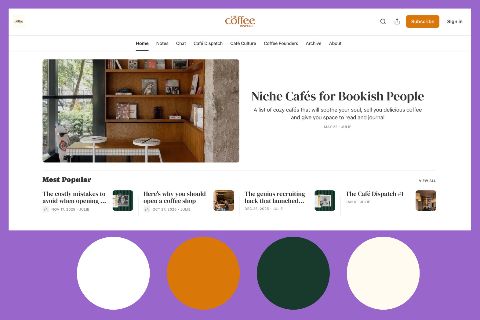
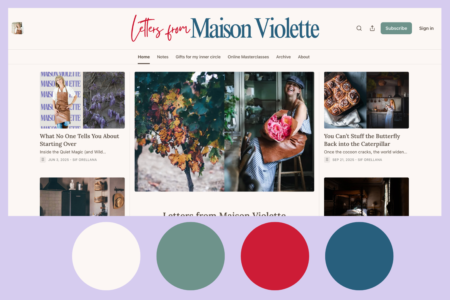
As you can see, every single palette is different. There’s no right or wrong choice here, only colors that fit you and colors that don’t. Each palette paints a style, a personality. Before you even read a word, you already have a sense of what kind of energy to expect.
So don’t start with what works for someone else, start with yourself.
Ask yourself:
What do I want people to feel when they land on my page? Calm and grounded? Bold and energized? Warm and personal? Clean and professional?
What colors do I keep coming back to in my own life, in my wardrobe, my home, the brands I love?
If my Substack were a physical space, what would it look like? A sunlit studio? A cozy reading corner? A sharp, modern office?
Your answers will tell you more about your palette than any trend guide ever could. The colors that feel like you are the ones your readers will remember.
📢 One more thing
Summer is coming, and if you’re anything like me (read: a mom), that means calls are not happening. Which is exactly why Pocket Mentoring is back ☀️
This is async mentoring through Voxer, and it’s one of my favorite ways to work with creators. We go back and forth on your real questions in real time, no scheduling, no waiting. Past rounds have led to complete homepage redesigns, first paid subscribers, and content strategies that finally clicked. And I got to meet some truly incredible creators along the way.
If you want to actually move forward with your Substack this summer, not just think about it, and get more done in 4 weeks than you usually do in 6 months, I’d love to work with you.
Warmly,
Andi
Let’s comment
Now I want to see yours. Drop your Substack link in the comments and tell me: are you happy with your colors, or is it time for a change?
Thank you, Andi. I played around with my Hungarian Ancestors page last night. So fun and easy for a non-techie.
I've stuck with the brand colors created for me. However I'm uncertain about the background color. Also, how do you get the watermark size to be so large on Ditch Your Templates. I also design in Canva and I've played around with it but haven't been able to make it sizable. This was a great article. Makes me want to change my colors!