

The New Substack: Visual, Branded, Memorable
The creators who understand this are building memorable, monetizable publications. The rest are getting lost in the noise.

Remember when Substack was simple? Pick two colors, choose a font, write. That was it. The platform attracted writers, journalists, and experts who wanted one thing: to publish their ideas without the noise of social media. Substack felt like a newsletter tool—text-focused, email-first, straightforward.
That era is over.
Substack publications are transforming into visual experiences. The platform isn’t just a place to send weekly emails anymore.
It’s where creators build worlds.
And those worlds need to be recognizable, memorable, and distinct in a sea of thousands of other publications competing for the same readers’ attention.
This shift isn’t about aesthetics for the sake of aesthetics. It’s strategic. Because here’s what’s happening: readers don’t just subscribe to content anymore. They subscribe to experiences, identities, and publications that feel like destinations, not just another email in their inbox.
If you’re using Substack to build a business—not just as a personal diary—this is for you.

From Newsletter Tool to Visual Platform
In the early days, Substack’s limitations were actually its appeal. The platform forced simplicity. You couldn’t overthink design because there wasn’t much to design. Writers loved this—it meant they could focus purely on writing.
But as the platform grew and competition intensified, those limitations started to feel like... well, limitations. Creators wanted more control. They wanted their publications to stand out, not just blend into the same template as everyone else’s.
Substack has responded with some updates—custom colors, basic customization options—but honestly, the platform still offers relatively few design tools. And I’m certain they’re working on changing that. The future will bring more control over layouts, visual elements, and branding options.
But here’s what’s interesting: creators aren’t waiting for Substack to build these features. They’re getting creative with what’s already available. Custom dividers instead of plain lines. Strategic use of images and spacing. Or thoughtful typography choices. Or smart section layouts that create visual rhythm.
They’re building magazine-like experiences within a platform that wasn’t originally designed for it. And it’s working.

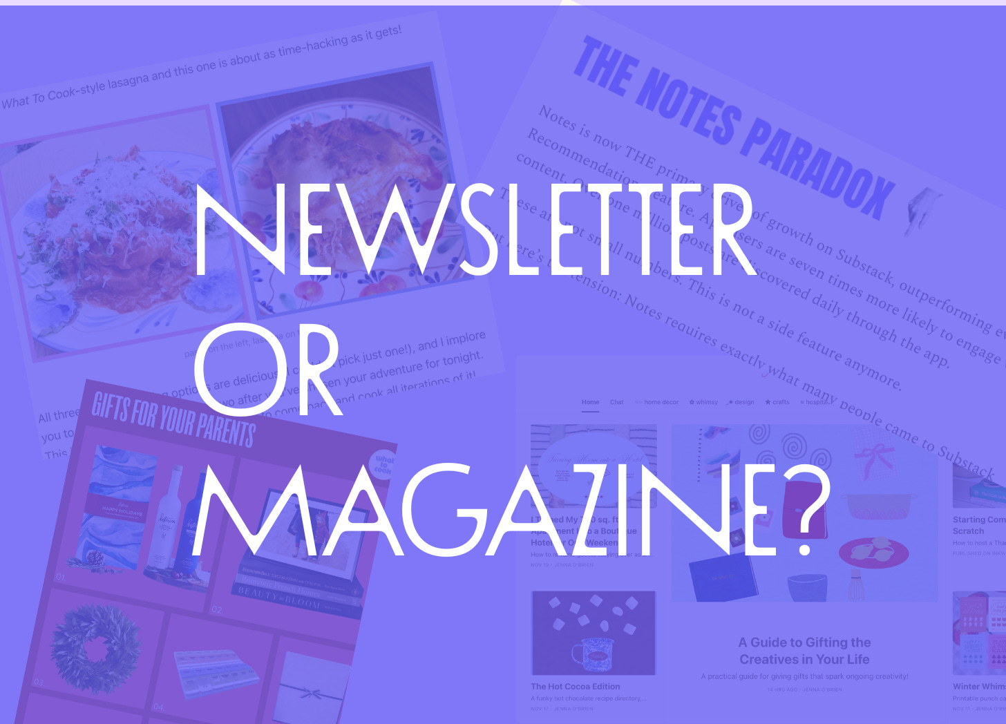
What Does a Magazine-Style Substack Actually Look Like?
Let me show you what I mean. These creators are using Substack’s current tools in ways that transform their publications from basic newsletters into visual experiences.
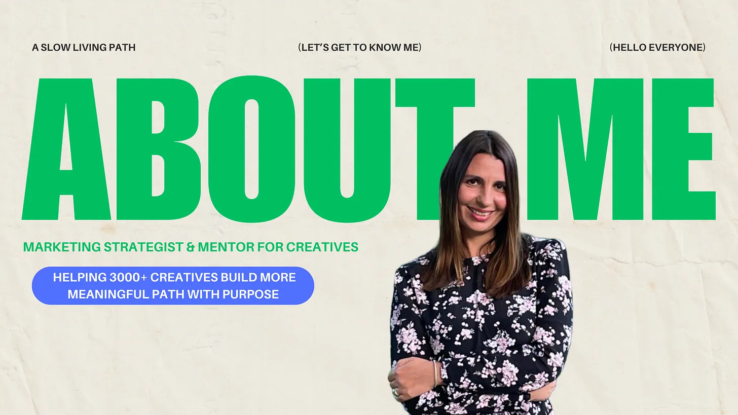
A Slow Living Path created an About page that feels like flipping through a lifestyle magazine. Custom-designed text-based images, carefully curated layout, intentional visual breaks. It’s thoughtful. And it immediately communicates the aesthetic and values of the publication before you even read a word of the actual content.
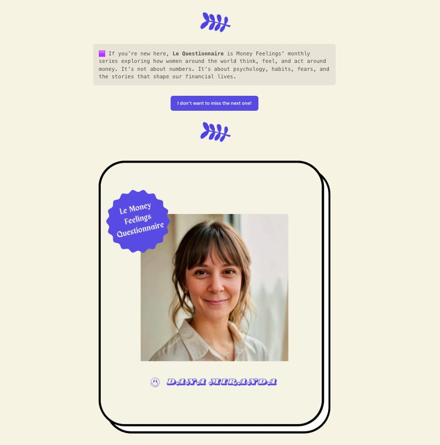
Money Feelings by Pauline takes a topic that could feel dry or intimidating—personal finance—and transforms it into something approachable and memorable. She uses a consistent purple color palette throughout, adds emojis to her post titles, and designs custom dividers that break up her content visually. Every image is intentional, recognizable, and reinforces her brand. The result? A publication about money that feels warm, creative, and distinctly hers.
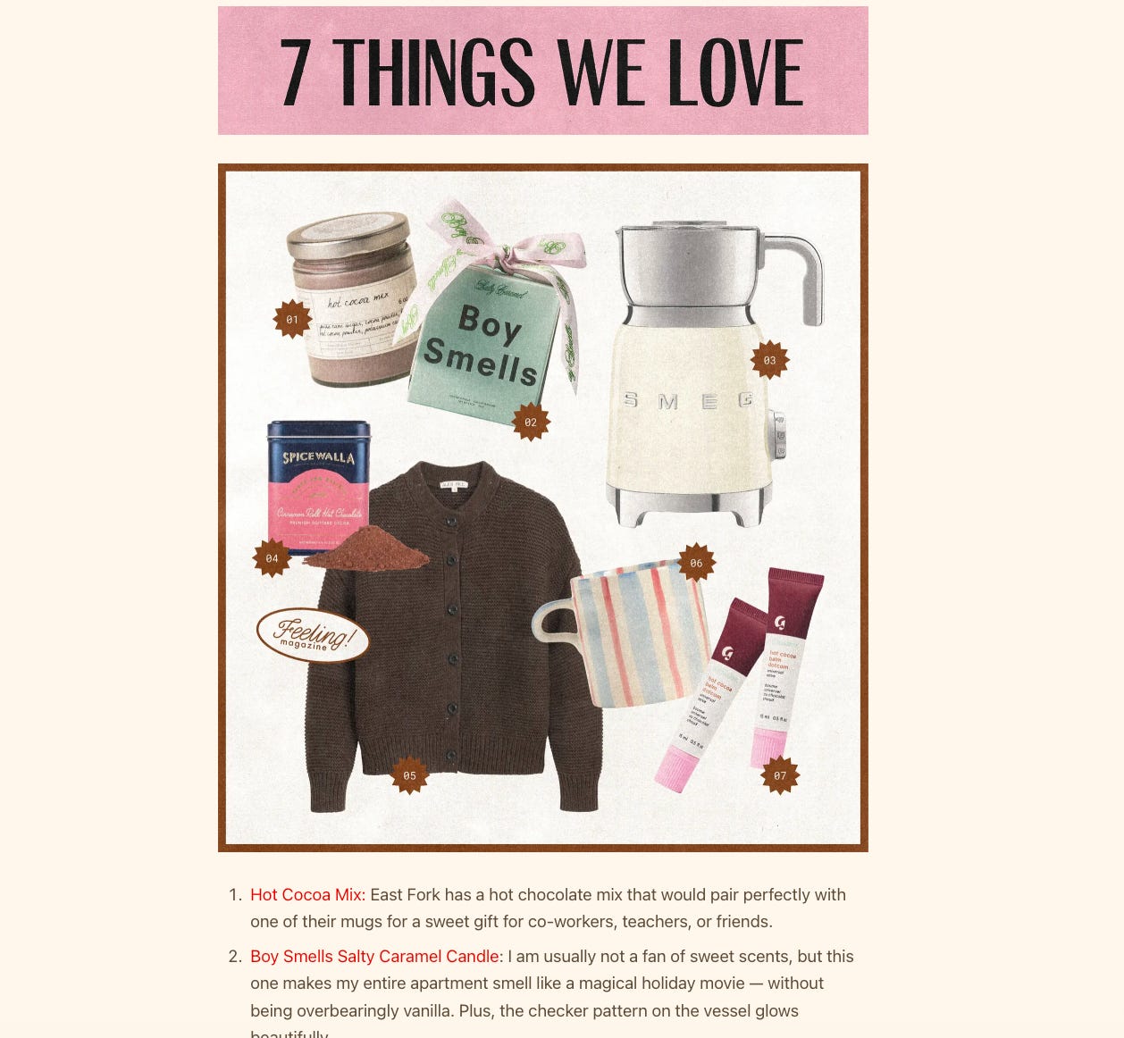
Feeling! Magazine doesn’t just call itself a magazine—it actually looks and functions like one. Posts are organized into sections with custom icons that immediately draw the eye and guide readers through the publication. Each post is filled with original graphics, photography, and designed headers that create a cohesive visual language. It’s a perfect example of how strategic visual choices can transform a Substack from a simple newsletter into an actual editorial experience.
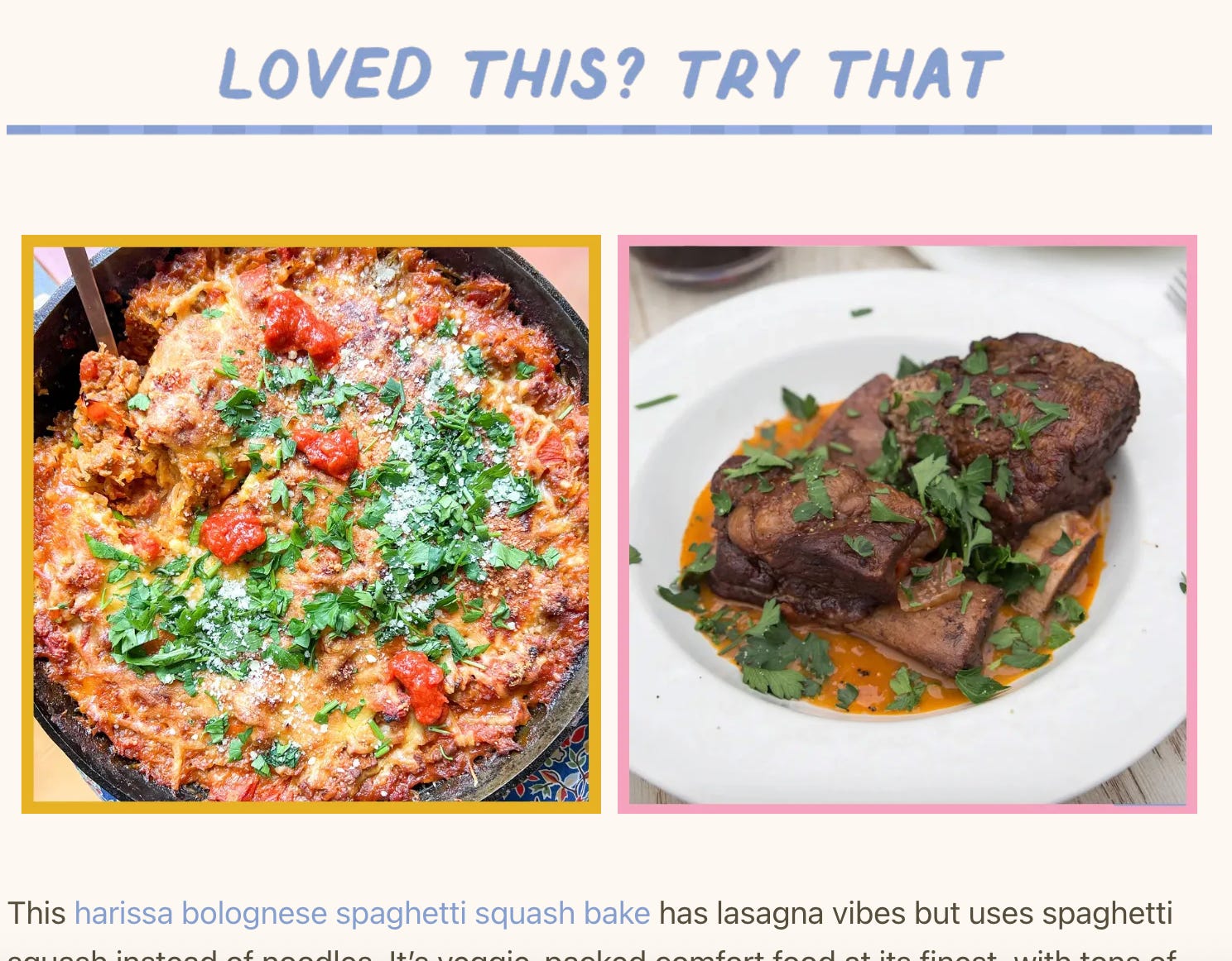
What to Cook uses a distinctive color palette throughout and fills every post with photo collages, pull quotes, playful headers, and custom dividers. The food photography is unified by adding colored borders to each image—a simple trick that transforms standard recipe photos into branded content that feels cohesive and intentional. It’s a masterclass in using small visual choices to create a big impact.
But Here’s the Critical Part: Mobile Matters
All of this visual creativity is exciting, but it only works if your content remains readable on mobile. And the reality is, most of your readers are on their phones.
So before you go wild with custom graphics, elaborate layouts, and complex visual elements, open your post on your phone and actually read it. Are those beautiful text-based images legible on a small screen? Do your custom dividers load properly? Are your photo collages clear or cluttered?
The goal isn’t just to make your Substack look like a magazine. It’s to make it feel like a magazine—polished, intentional, and easy to experience—no matter where someone is reading it.
Update: It’s Already Starting
As I was finishing this post, Substack gave Bestseller publications access to new customization features for the header and the footer. I updated mine and love it.
So, What’s Your Next Move?
Open your Substack. Look at it. Does it feel like a newsletter you send out weekly, or does it feel like a destination people want to visit?
You don’t need to overhaul everything overnight. Start small. Add a custom divider. Create a branded image for your About page. Choose one visual element that makes your publication instantly recognizable.
Because the creators who are building memorable, monetizable Substacks aren’t waiting for the platform to give them permission. They’re using what’s available right now—creatively, strategically, intentionally.
The shift is happening. The question is whether you’re going to be part of it.

If this was useful…
If you found this post helpful, the best way you can support my work is by sharing it with someone who’d benefit from it too.
Substack grows through word of mouth — every time you forward a post, you’re helping me reach more creators who need these insights. And I’m grateful for that. 🤍
Illuminating as always! Thank you for teaching us, Andi! 💜
Thanks as always Andi for your insights! If one is just starting out, would you suggest first focusing on building out your written content before focusing on visuals? Or is it better to do both in tandem?
I plan to hire a graphic designer but figured I should first have more posts before doing so.