

5 Quick Substack Design Tweaks You’re Probably Missing
Your publication already has these tools. You're just not using them yet.

I’ve spent a lot of time talking about Substack design lately—from picking the right color palette to creating great post graphics and nailing your layout.
But today, we’re skipping the heavy strategy. Today is just for the fun stuff.

I’ve rounded up five specific, underused features hidden away in your Substack settings. They only take a few minutes to set up, but they’ll make your publication look like you spent the whole weekend redesigning it.
Because let’s be honest about the “design doesn't matter, it's all about the writing” debate: yes, your content is what matters most. But if your homepage looks completely blank, generic, and just like every other default publication out there, people might not stick around long enough to read a single word. Substack is becoming your home base, your little corner of the internet, your media company, not just a generic, black-and-white newsletter feed.
When a publication looks like someone actually cared about the details, readers notice. They trust it more, even before they start reading. So, let’s make yours one of those.
1. Give Your Subscribe Block a Makeover
You know that big subscribe banner on your homepage? Most writers either completely ignore it or leave it on the factory default settings.
But here is the trick: you can customize the message separately for non-subscribers, free readers, and paid subscribers. That’s already great, but almost nobody touches the design side of it. You can actually change the background color and upload a custom logo or image.
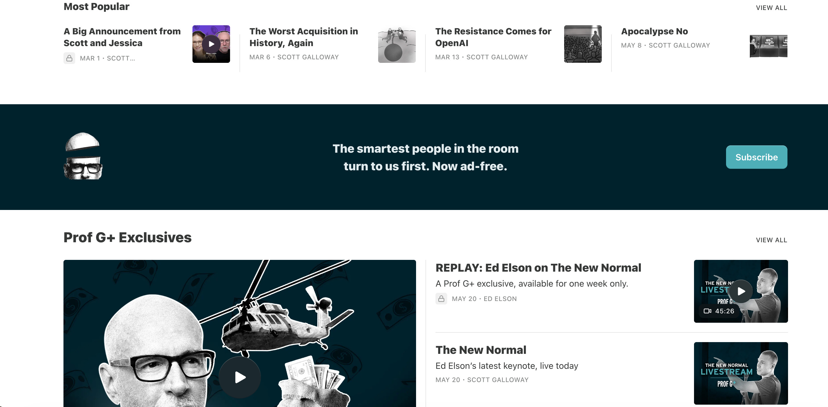
Instead of a generic Substack prompt, your subscribe block can finally match your vibe and brand colors. Just head to the Website Editor, find the Subscribe block in your homepage settings, and play around with it. It takes two minutes, and it’s one of those tweaks that will make you wonder why you didn’t do it sooner.
2. Your Logo Can Be a GIF
Okay, this one is just pure fun.
Your publication logo doesn’t have to be a static image, Substack actually supports GIFs. This means your logo can subtly move, shift colors, or fade in a way that makes your page feel alive.
A quick word of warning: subtlety is your friend here. Don’t turn your header into a 90s disco ball. Think of a gentle color shift, a soft shimmer, or a slight movement. You want something that makes people pause for a second and think, “Wait, is that moving?” rather than giving them a headache.
3. Dropdown Menus in the Navigation Bar
This is a newer feature, and honestly, I’m a little too excited about it.
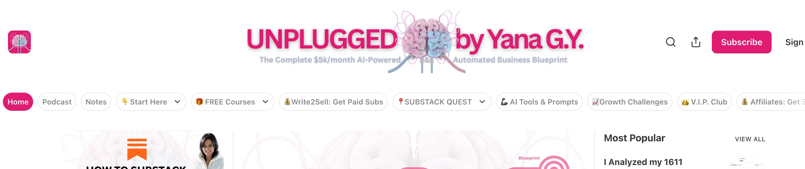
For the longest time, the Substack navigation bar was completely flat. You had Home, Archive, About, and maybe a custom link. It worked, but it felt limited. Now, you can finally create dropdown menus.
This means you can group related pages under a single label. Your sections, tags, shop, podcast, or extra resources can all live neatly in a tidy drop-down instead of stretching your navigation bar across the entire screen. It turns your Substack from “a newsletter with a feed” into a proper, organized website.
To set it up, go to Settings, scroll down to the Navigation bar. Add your links, then just drag and drop one underneath another to create a group. Give the group a title, and you’re done.
4. Image Roundness on Your Homepage
This one is sneaky. It’s a tiny slider in the Website Editor that quietly changes the whole mood of your homepage.
You can actually adjust how sharp or rounded your post thumbnail images are—ranging from crisp, sharp squares to soft, rounded edges, or even full circles.
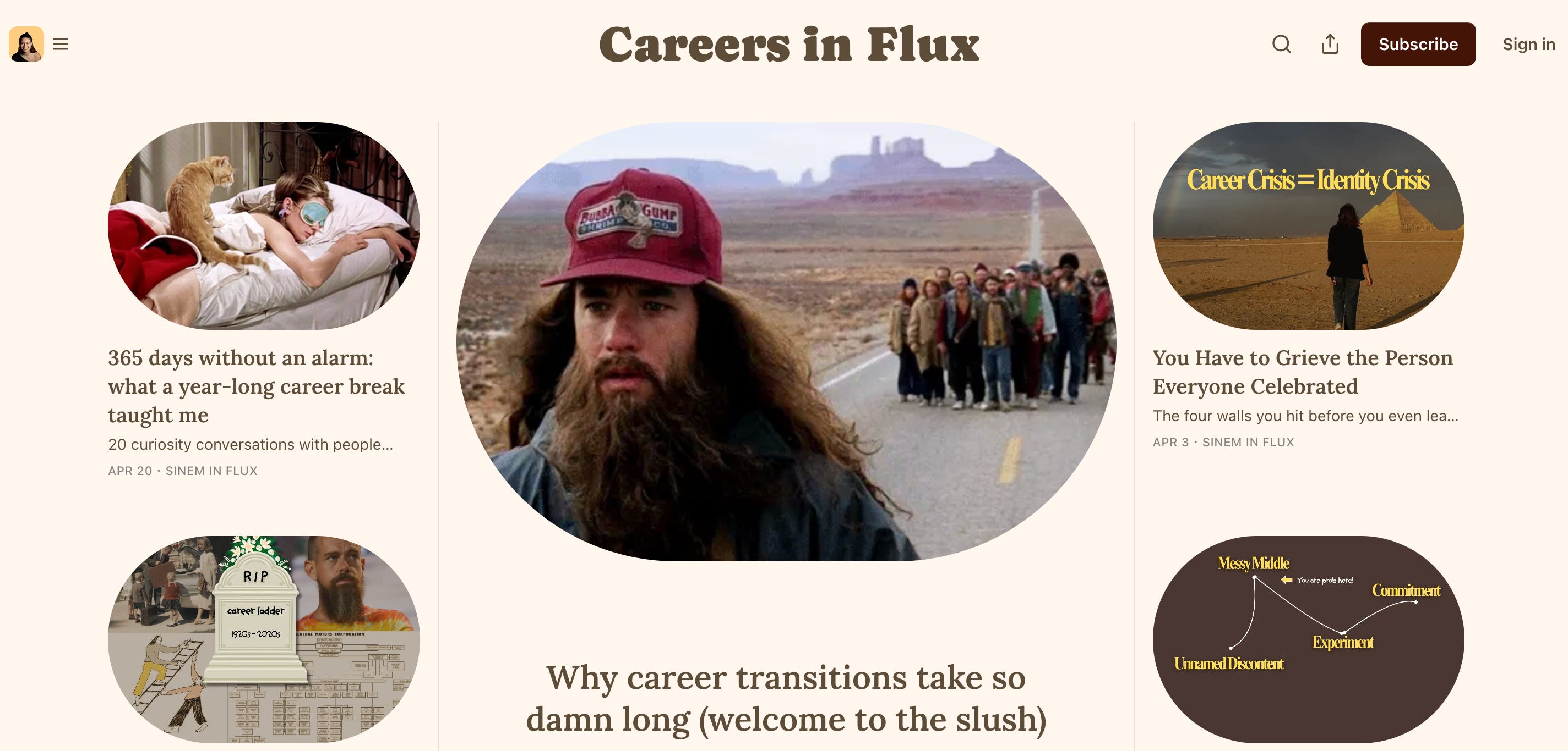
Why care? Because shapes have a vibe. Sharp corners feel editorial, structured, and serious. Rounded corners feel warmer, friendlier, and more personal. Circles feel modern and intimate.
There’s no right or wrong choice here; it’s just about what matches your voice. But since most creators never touch this setting, their homepages default to the standard look. Don’t miss the chance to make your page look intentionally yours.
5. Customize Your Footer (Yes, You Have One)
I saved the most overlooked one for last. Your homepage has a footer, you can customize it, and almost nobody does.
In the Website Editor, you can set a custom background color for your footer, display your publication name, and link your social media. It’s a small section at the bottom of the page, but it does exactly what a good footer should: it closes the page nicely, gives readers a place to go next, and makes the site feel finished.
Without it, your homepage just... ends. With it, you get a clean visual full stop.
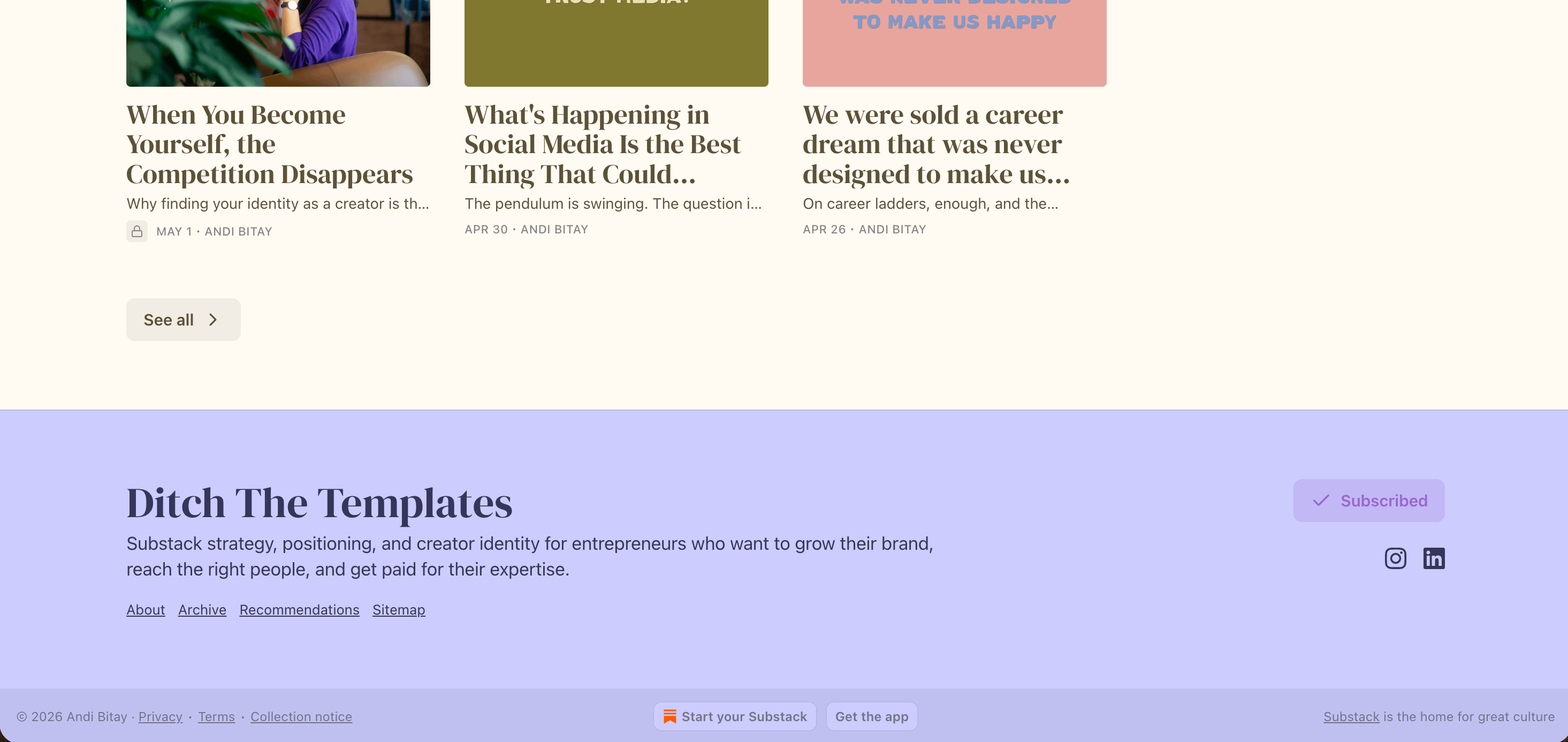
If you’ve already picked out your publication’s color palette, use one of those colors here for some instant cohesion. It’s the kind of detail that makes people think you hired a designer. You didn’t, but that can be our secret.

None of these tweaks are massive overhauls. They’re just five-minute upgrades, but they add up to something much bigger: a publication that looks like it was built with genuine care.
When someone lands on your Substack for the first time, they decide whether to stay within seconds. Your writing is what keeps them there, but your design is what gets them to stop and start reading in the first place.
It’s your corner of the internet. Make it look like you live there.
I do Substack Audits where I look at your publication with a fresh pair of eyes. A part of this is the First Impressions Audit—looking at exactly what a new reader sees within the first five seconds of landing on your page.
This isn’t a checklist. It’s a deep, 10-to-15-page PDF made specifically for your publication, packed with personalized feedback and practical tweaks you can make right away.
If you want to turn your Substack into a space that feels uniquely yours and instantly grabs your readers’ attention, you can check out the Substack Audit here.
Warmly,
Andi
Had no idea about some of these!!
Thanks for sharing!!